How I built this site: near-perfect PageSpeed, no framework
No WordPress, no build step, no JavaScript framework. Just hand-written static HTML, self-hosted fonts and images, and a single file of edge configuration — deployed to Cloudflare for free. The result is a clean 100 for SEO, accessibility and best practices. Here is the whole recipe.
I tell clients to build fast, clean sites. It would be a poor look if my own were slow, so when I rebuilt this one I held it to the standard I hold theirs to: open it in Google's PageSpeed Insights, run it, and don't ship until the numbers are honest. Here is exactly what they came back as — desktop and mobile, unedited.
None of this needed a clever trick. It came from a handful of unglamorous decisions, made in order, each of which I can hand to you below. If you build sites, you can copy the lot. If you'd rather not, that's a service.
Fast is a subtraction problem
The single most useful idea in web performance is that speed is mostly about what you leave out. Every framework, every analytics tag, every web font, every "just one more" script is weight the browser has to fetch, parse and run before a visitor sees anything. Most slow sites aren't slow because of one big mistake; they're slow because of forty small additions nobody removed.
So the brief I set myself was almost rude in its simplicity: a personal site is text, a few images and a couple of small interactions. It does not need a render pipeline, a hydration step or a 200 KB JavaScript bundle. Strip the project back to what the content actually requires, and the scores mostly take care of themselves.
Most slow sites aren't slow because of one big mistake. They're slow because of forty small additions nobody removed.
Step 1Build it as static HTML
There is no CMS behind this site and no build step in front of it. Each page is a hand-written .html file with the critical CSS inlined in the <head>, so the browser can render the page from the very first response without waiting on a separate stylesheet. The markup is semantic — real <header>, <nav>, <main>, <article> and <footer> landmarks rather than a soup of nested <div>s — which helps screen readers, search crawlers and AI extractors alike find the substance.
I designed and assembled the whole thing inside Claude, iterating on layout and copy as editable HTML rather than mocking it in a design tool and rebuilding it later. That kept one source of truth: what I previewed is byte-for-byte what deployed. The only JavaScript is a single site.js of roughly eight kilobytes, loaded with defer and written with no inline handlers — a deliberate choice, because keeping all script in one external file is what lets the site ship a strict Content-Security-Policy without tripping over its own code.
- Inline the critical CSS in the head; don't block first paint on an external stylesheet for a page this small.
- Use semantic landmarks so the document structure is legible to machines, not just to humans.
- One small, deferred script, no inline JavaScript, so a tight CSP is possible later.
Step 2Self-host the fonts
Web fonts are the most common quiet performance tax I see. Pulling them from a third-party host means an extra DNS lookup, an extra connection, and a render-blocking request to a domain you don't control — plus, post-Schrems II, a genuine GDPR question about leaking visitor IPs to that host.
So all three families here (Newsreader, Hanken Grotesk and JetBrains Mono) are self-hosted as woff2 variable fonts, subset to the Latin ranges the site actually uses, and served from the same origin. Each face is declared with font-display: swap so text is visible immediately in a fallback while the webfont loads, and the two faces needed above the fold are preloaded so they arrive early. No Google Fonts request, no layout surprise, no data leaving the origin.
<link rel="preload" as="font" type="font/woff2" href="/fonts/hanken.woff2" crossorigin>
<link rel="preload" as="font" type="font/woff2" href="/fonts/newsreader.woff2" crossorigin>
Step 3Ship images as sized webp
Images are usually the heaviest thing on a page, so they get the most discipline. Everything here is webp — markedly smaller than JPEG or PNG at the same quality — and every <img> carries explicit width and height attributes. That second part matters more than people expect: when the browser knows an image's dimensions before it loads, it reserves the space, so nothing jumps as the page fills in. That's how you keep Cumulative Layout Shift near zero, which is a direct Core Web Vitals input.
webpeverywhere, sized to the largest box each image is shown in — no shipping a 2000px photo into a 400px slot.- Explicit
widthandheighton every image, so the layout never shifts (the screenshots above included). loading="lazy"anddecoding="async"on anything below the fold, so off-screen images never delay the first paint.
Step 4Deploy to Cloudflare
Because the output is just static files, hosting is almost embarrassingly simple. There's no server to run, no database, nothing to patch. I deploy to Cloudflare Pages, which serves the files from a global edge network — so the site loads from a data centre near the visitor rather than from one origin box — with automatic HTTPS, HTTP/3 and a free tier that comfortably covers a site like this.
Getting it live is genuinely a drag-and-drop. In the Cloudflare dashboard you create a project and choose Upload your static files; you can connect a Git repository if you'd rather, but for a folder of HTML the direct upload is the fastest path. Point your custom domain at it and you're done.
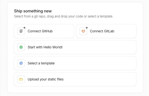
Upload your static files, point the domain at it, and it's served from the edge worldwide — for free, with HTTPS and HTTP/3 included.Step 5One _headers file for caching and security
This is the highest-leverage file on the whole site, and it's twenty lines long. Cloudflare Pages reads a plain _headers file at the project root and applies the rules to matching responses. It does two jobs.
First, caching: fonts, images and other assets get a one-year, immutable cache, so a returning visitor re-downloads almost nothing. Second, security headers: a strict Content-Security-Policy that only allows scripts from the site's own origin, plus HSTS, X-Content-Type-Options, a sensible Referrer-Policy and a locked-down Permissions-Policy. Those headers are most of what a "Best Practices" audit looks for, and they cost nothing but a few lines.
# Cache static assets hard — a year, immutable
/assets/*
  Cache-Control: public, max-age=31536000, immutable
/fonts/*
  Cache-Control: public, max-age=31536000, immutable

# Security headers on every response
/*
  X-Content-Type-Options: nosniff
  Referrer-Policy: strict-origin-when-cross-origin
  Strict-Transport-Security: max-age=63072000; includeSubDomains; preload
  Content-Security-Policy: default-src 'self'; script-src 'self'; ...
Step 6The plumbing that earns the 100
A perfect SEO score in Lighthouse isn't a ranking promise — it's a checklist confirming the page is technically legible to crawlers. It's worth getting to 100 because it means none of the basics are silently broken. Here's what carries it:
- A self-referencing
canonicalon every page, a unique<title>and a meta description in the right length band. - Valid JSON-LD structured data —
BlogPosting,PersonandOrganization— that matches what's visibly on the page, never contradicts it. - A real
sitemap.xml,robots.txtand anllms.txt, so both search crawlers and AI systems get a clean map of the site. - Open Graph and Twitter card tags, descriptive
alttext on every image, and legible tap targets and contrast.
If the honesty of that structured data sounds like a small thing, it isn't — it's the spine of how AI search decides whether to trust a page. I went deep on exactly that in the 120-point AI readiness framework; this post is the technical floor that sits underneath it.
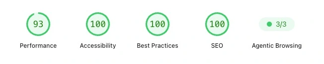
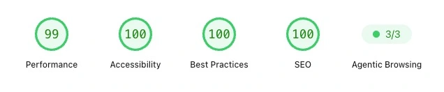
The one score that isn't 100
Everything except Performance comes back a perfect 100 — SEO, Accessibility and Best Practices alike — and Agentic Browsing, Lighthouse's newest category, passes 3/3. That last one checks whether an AI agent can actually read and operate the page: layout stability, a clean accessibility tree, properly labelled controls. The only number below 100 anywhere is Performance: 99 on desktop, 93 on mobile.
I'll be straight about that 93 rather than crop it out. Lighthouse's mobile run deliberately simulates a mid-range phone on a slow connection with a throttled CPU — a punishing, worst-plausible-case scenario, not the device most visitors hold. A 93 under those conditions is a strong, honest result. I could likely nudge it to 100 by inlining or deferring a little more, but past a point you're optimising for the test rather than the person, and the page already paints almost instantly on real hardware.
A score is a guide, not a boss. I'd rather ship a transparent 93 on a deliberately harsh mobile test than chase a round number with changes that help the lab and not the person holding the phone. The 3/3 on Agentic Browsing matters more to me anyway — it's the same readiness I score client sites on in the AI readiness framework, and it's the part most sites will be caught out by next.
That's the whole recipe. Static HTML, self-hosted fonts, sized webp, a static host, twenty lines of edge config, and the SEO basics done properly. None of it is exotic. The hard part isn't knowing the steps — it's the discipline to keep leaving things out.
Want a site that scores like this out of the box?
I build and rebuild fast, static, search-ready sites — and bring tired WordPress installs back to life on Cloudflare's edge. You get the clean technical foundation, the SEO plumbing done properly, and an honest report of where you stand, the same one I just showed you for my own site.
Talk about a build